Joruva

Challenge

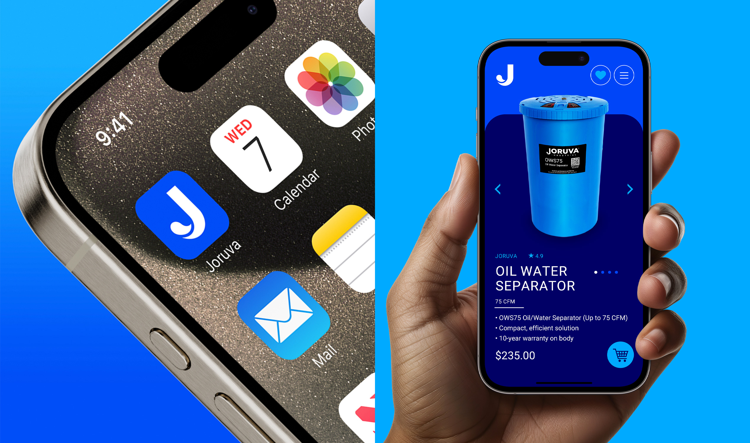
Joruva needed a distinct, premium brand identity to compete in the industrial oil-water separator market. The strategy was to signal technical innovation and environmental responsibility while establishing credibility with large-scale clients. Competing with more established brands, Joruva required a bold positioning to stand out as the modern, forward-thinking alternative.

Solution

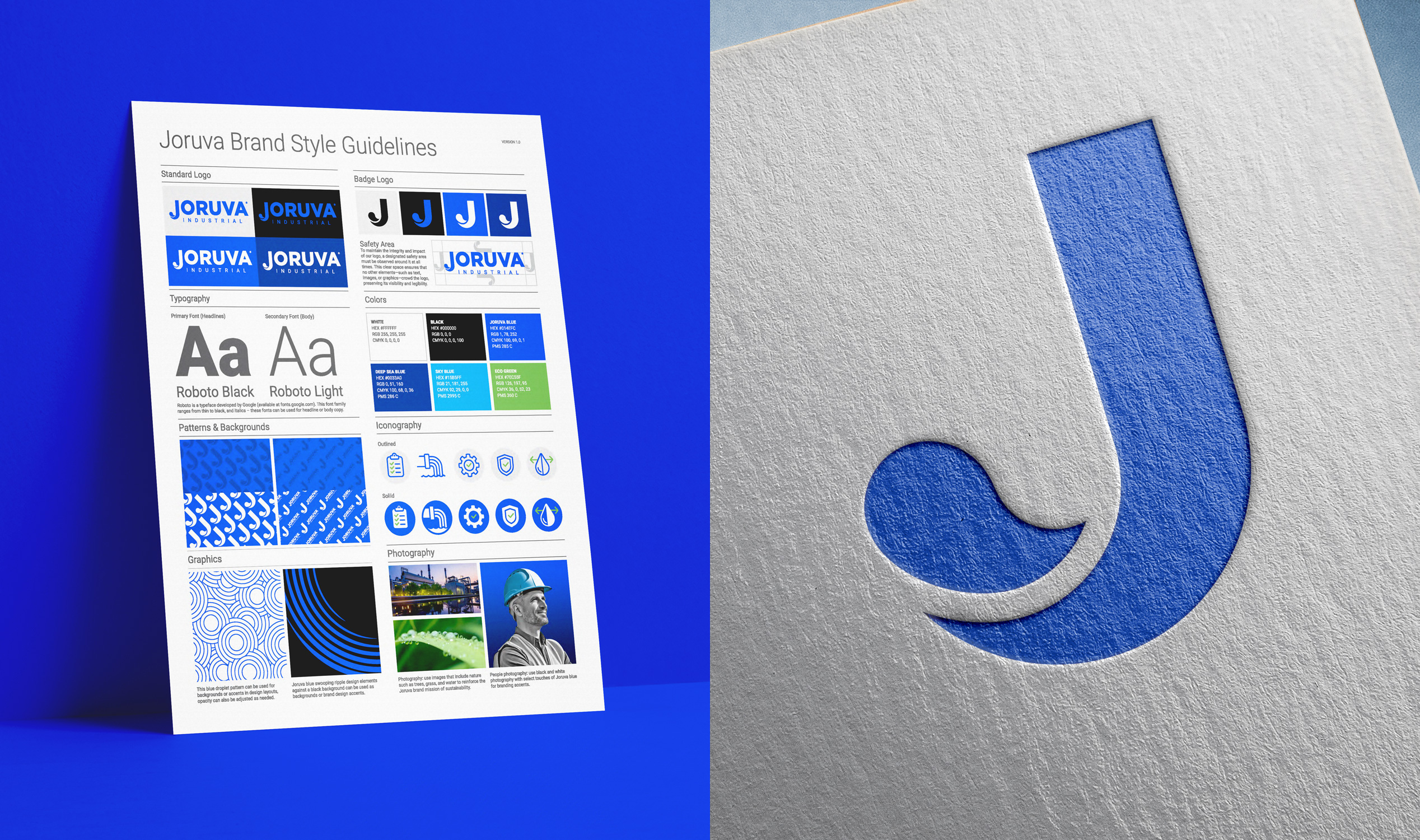
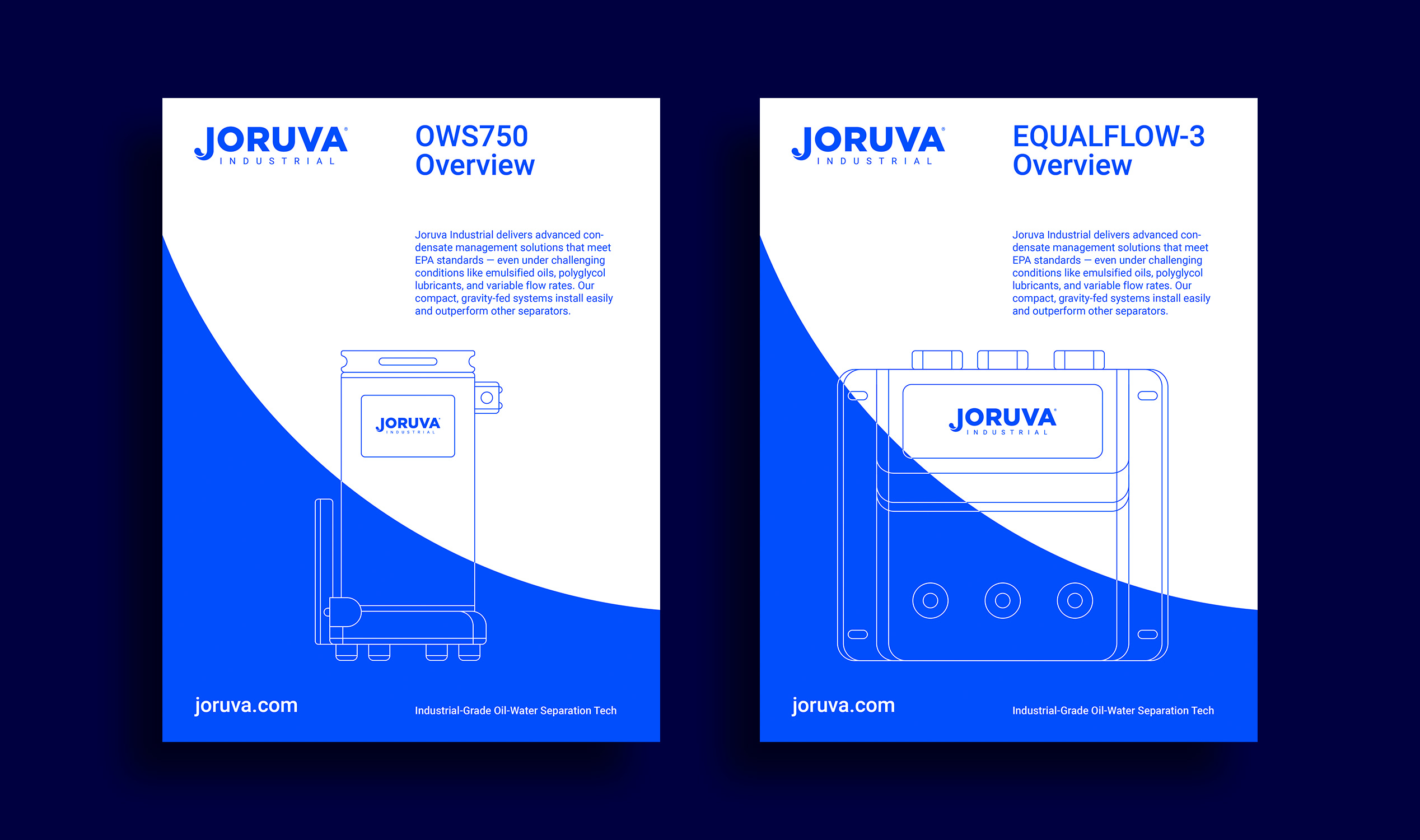
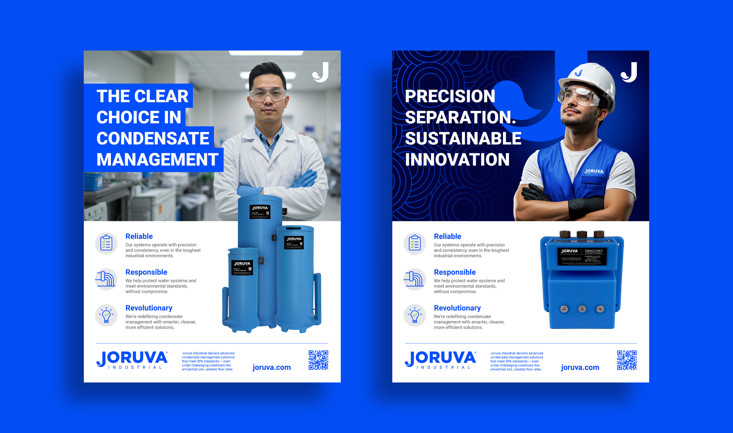
I created a sleek, modern brand identity system that balanced clean design with eco-conscious cues. The system included a logo suite, flexible typography, a refined color palette, iconography, digital assets, and a comprehensive style guide to ensure consistency. Through strategic visual direction, Joruva’s new branding projects trust, innovation, and sustainability—positioning them as a next-generation leader in their category.

Services

+  Branding

+  Design Strategy

+  Logo Design System

+  Product Visualization

+  UI Design

+  Digital Content

+  Environmental Design

+  Marketing Assets
Pull-Ups


Challenge

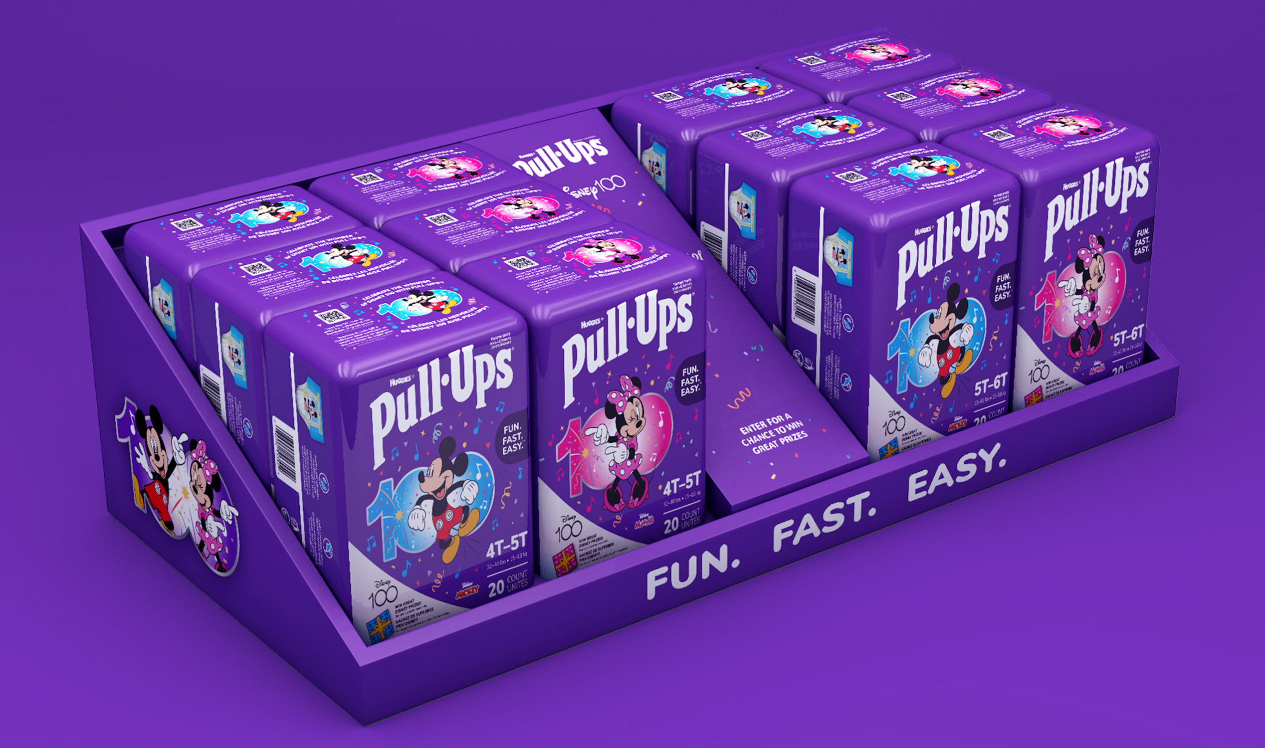
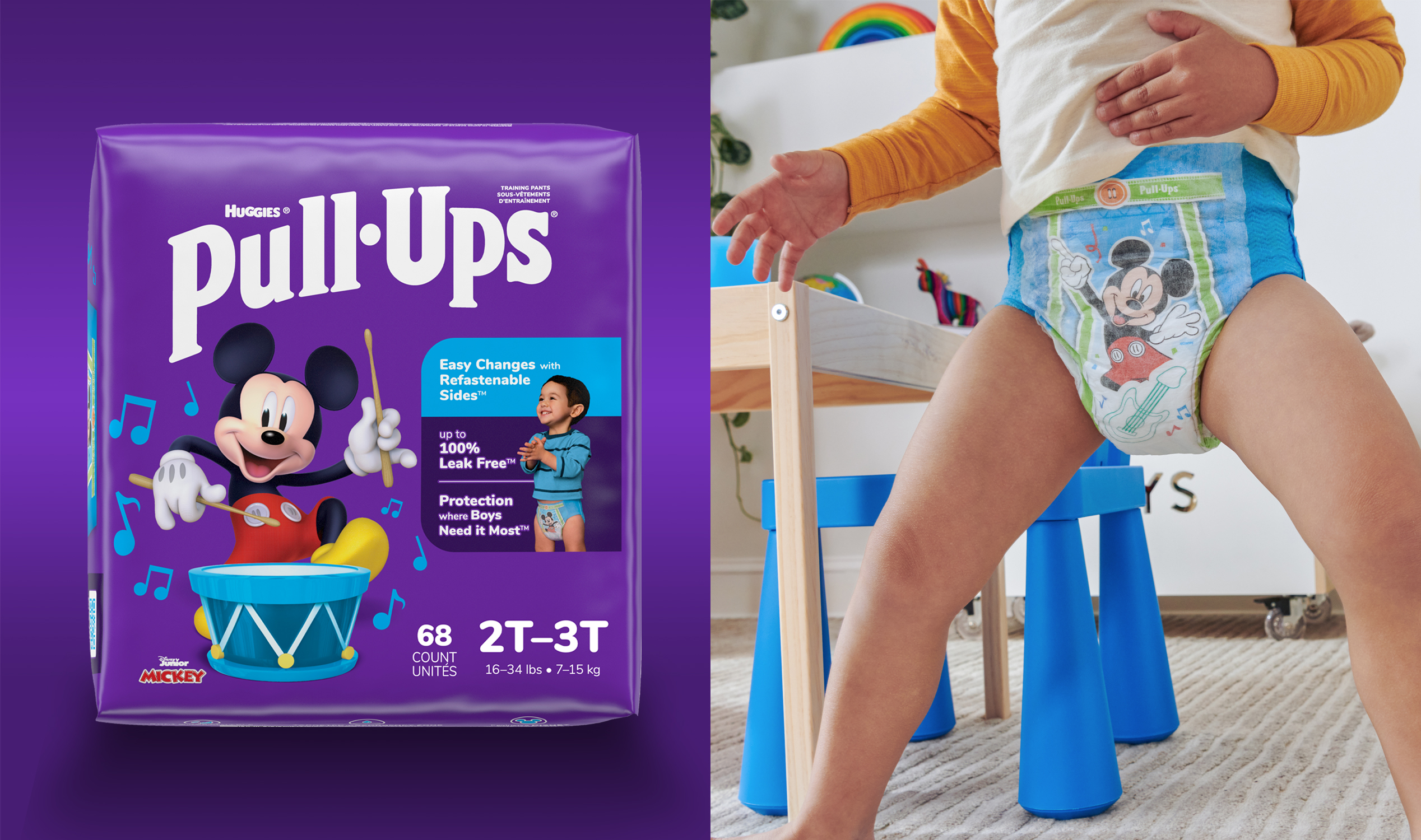
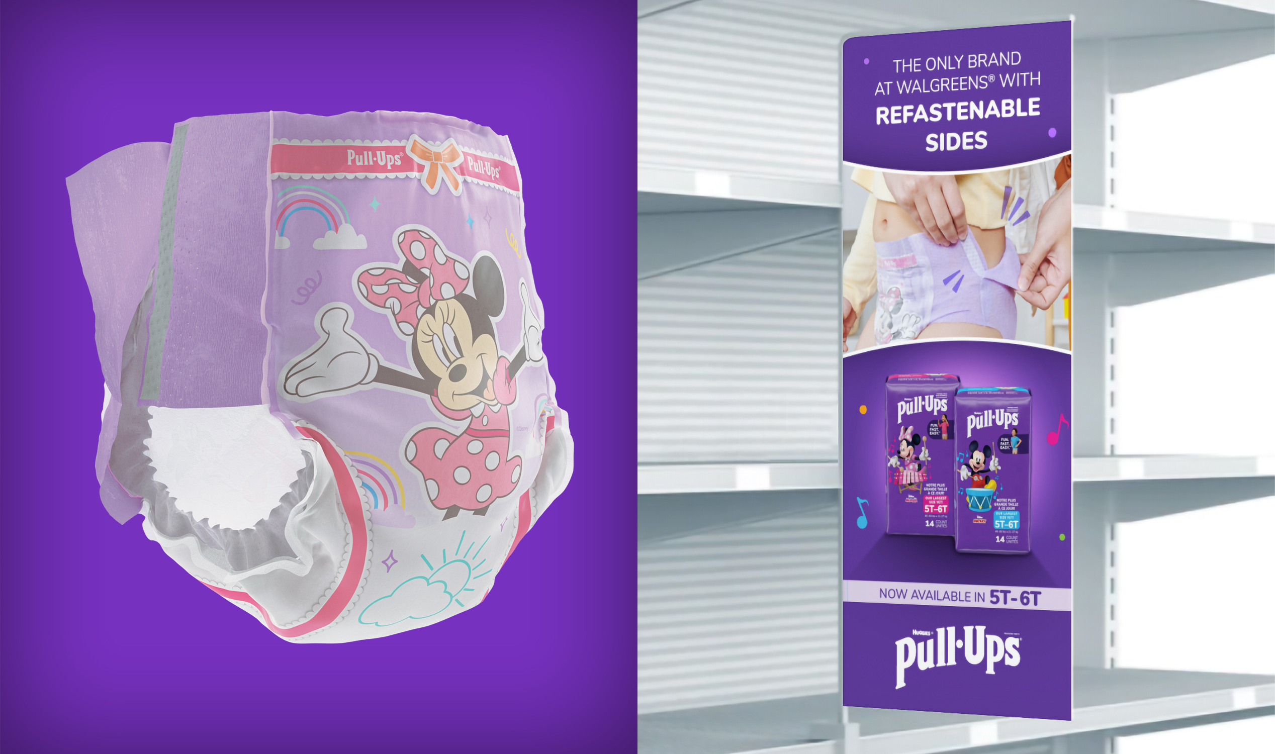
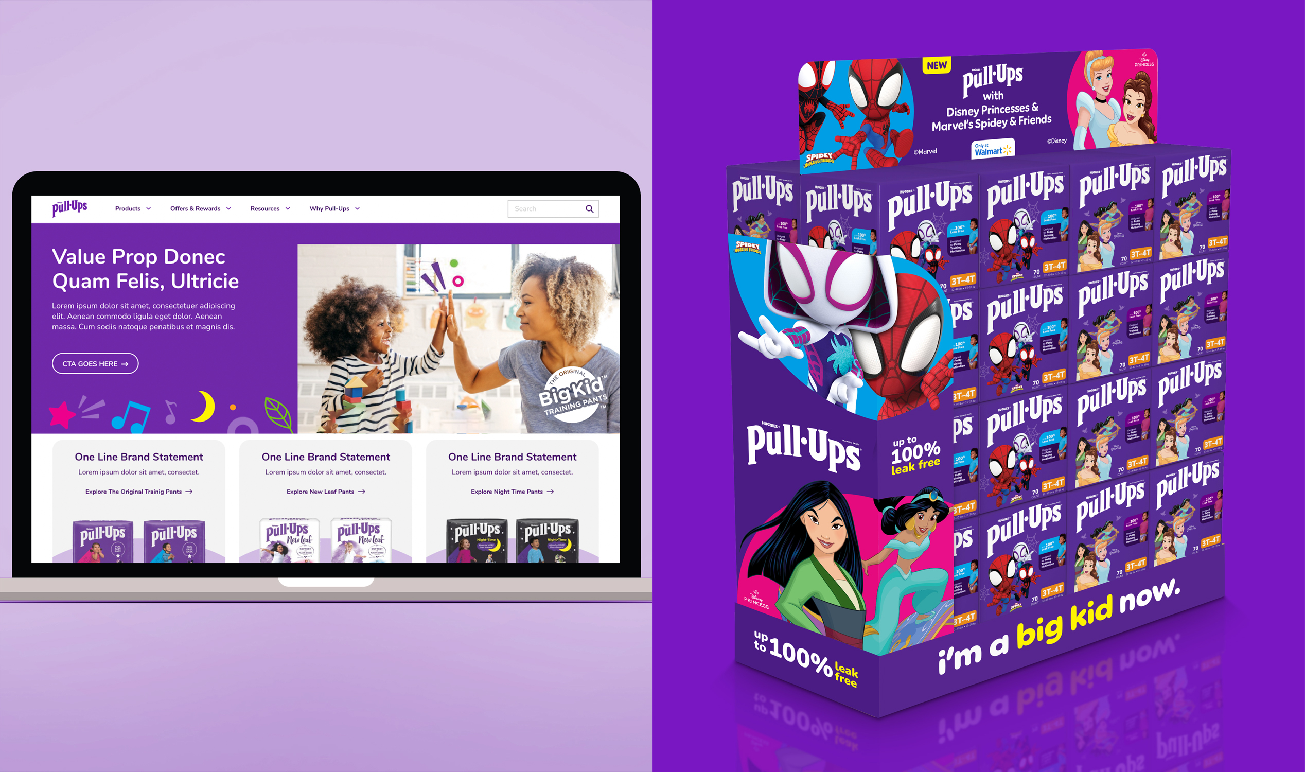
Pull-Ups was feeling pressure from national competitors and retailer-owned brands. The packaging looked outdated and inconsistent across the portfolio, with old photography and weak shelf presence. We also needed to better leverage our Disney partnership, a proven driver for parents and kids. My role was to lead a strategic visual refresh that modernized the brand, improved consistency, and enhanced impact both in-store and online.

Solution

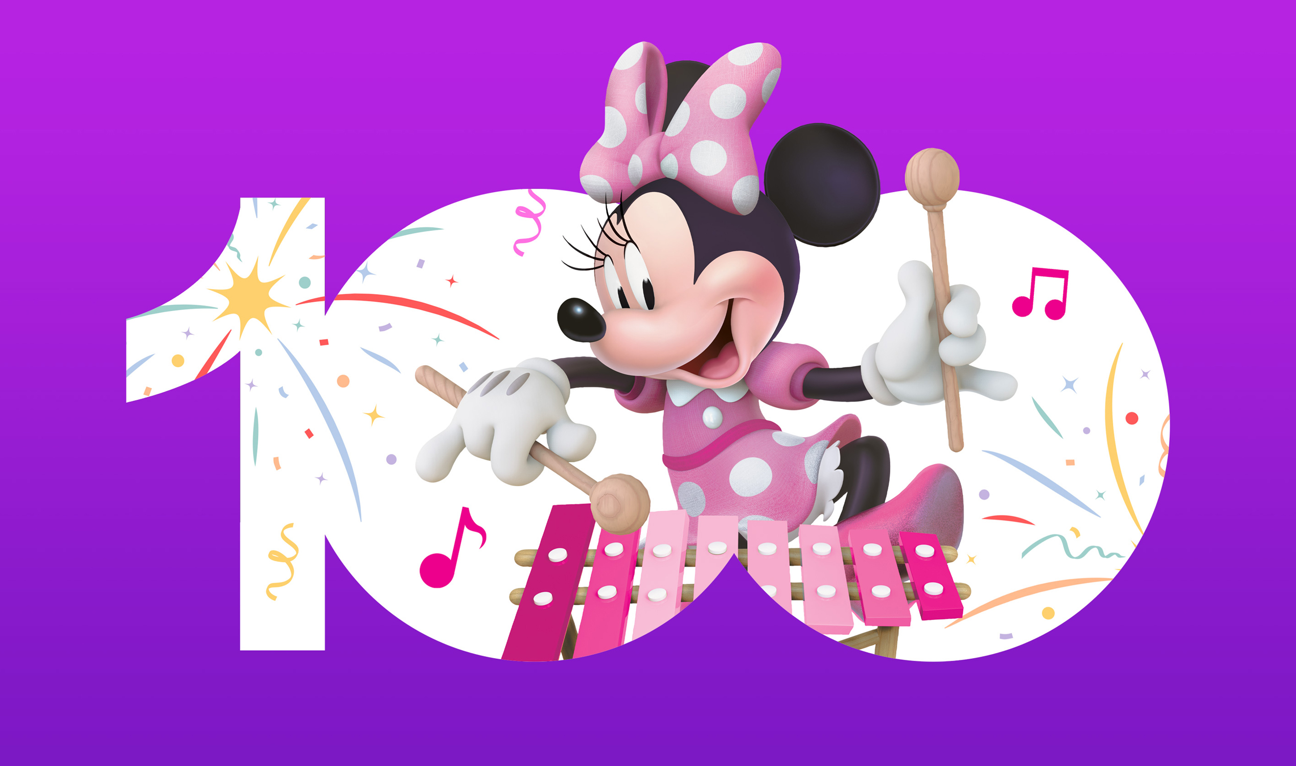
I developed a bold, modern, and colorful packaging system designed to connect with potty training parents and their kids. We strategically optimized the use of Disney and Marvel characters to maximize their impact and appeal. I also refined the product claims and benefits lockup to improve shelf readability and performance. Beyond the pack, I helped lead the design strategy across CPG packaging, product graphics, and key digital touchpoints, ensuring a cohesive brand experience at every interaction.

Services

+  Packaging Design System

+  Design Strategy

+  Product Graphics

+  Website Design

+  Social Media

+  3D Visualization

Play


Challenge

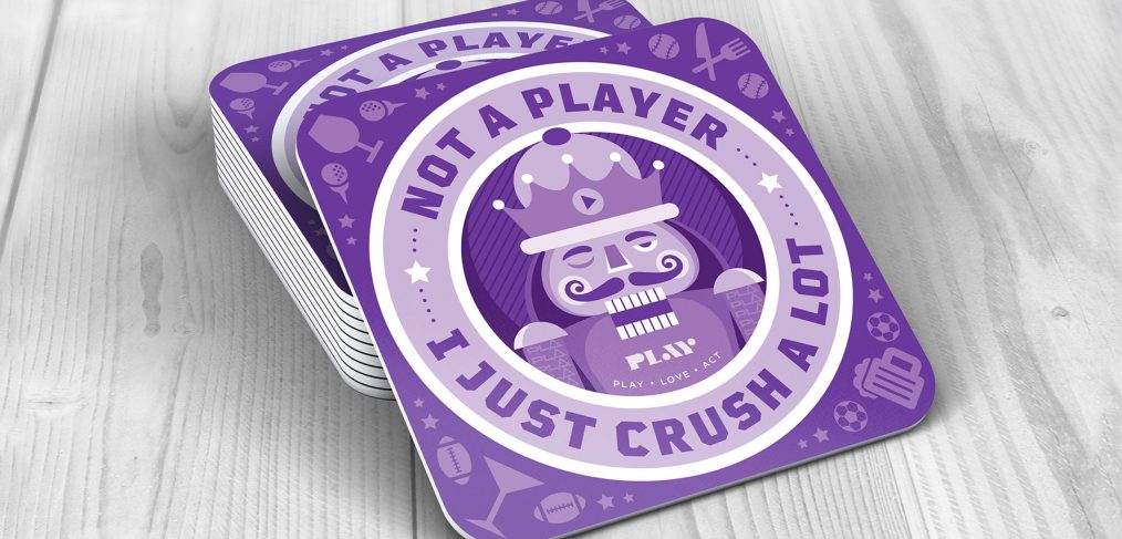
Play is an interactive sports bar experience located inside the hard rock cafe in Hollywood Florida. They were in need of a brand identity logo and custom illustrations for their flagships grand opening. They had a tight timeline and no brand design system in place.

Solution

We created a modern minimal brand logo and design system that conveyed high-end as well as expressing the idea of playfulness. Additionally, we created custom illustrations with various messages along with the ability to write a personal message on the backside of the coaster and mail it to a friend. The Grand opening was a great success and entertains a busy crowd of patrons daily.

Services

+  Illustration

+  Stationery Design

+  Logo Design

+  Print Collateral

+  Website Design

+  Social Media

Mapa Pro


Challenge

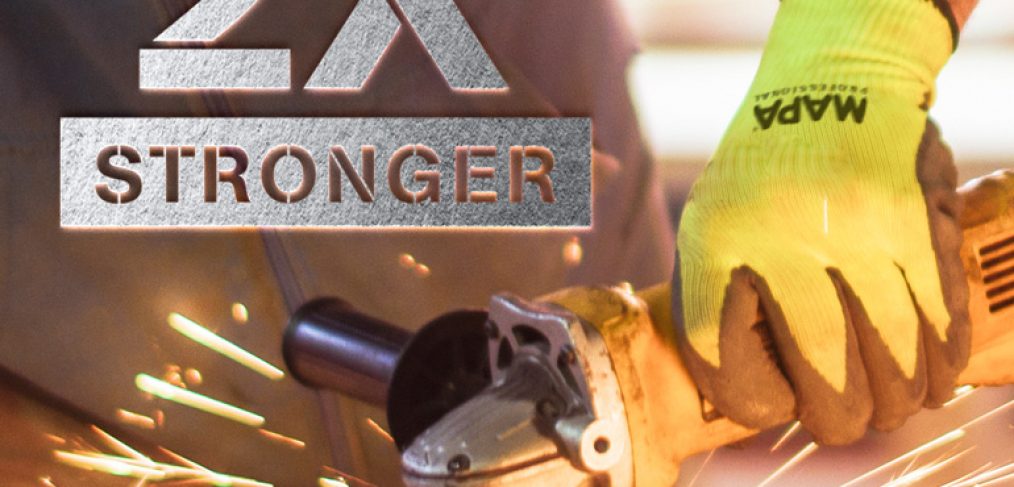
Mapa Pro has been a leader in the work glove category for decades. They needed to refresh their look to attract the modern professional and reintroduce their brand to the world. Mapa’s branding had become dated and stale and was in desperate need of new life.

Solution

We refreshed the brand by introducing a modern identity, brand expression, sleek packaging, and a merchandising system that allowed for expanded SKUs, better communication on shelf, and a greater presence online and at top retail stores throughout North America.

Services

+  Packaging

+  Illustration

+  Brand guidelines

+  Print Collateral

+  Iconography

+  Pallet & Merchandising

+  3D modeling & rendering

+  Social Media

EcoPark


Challenge

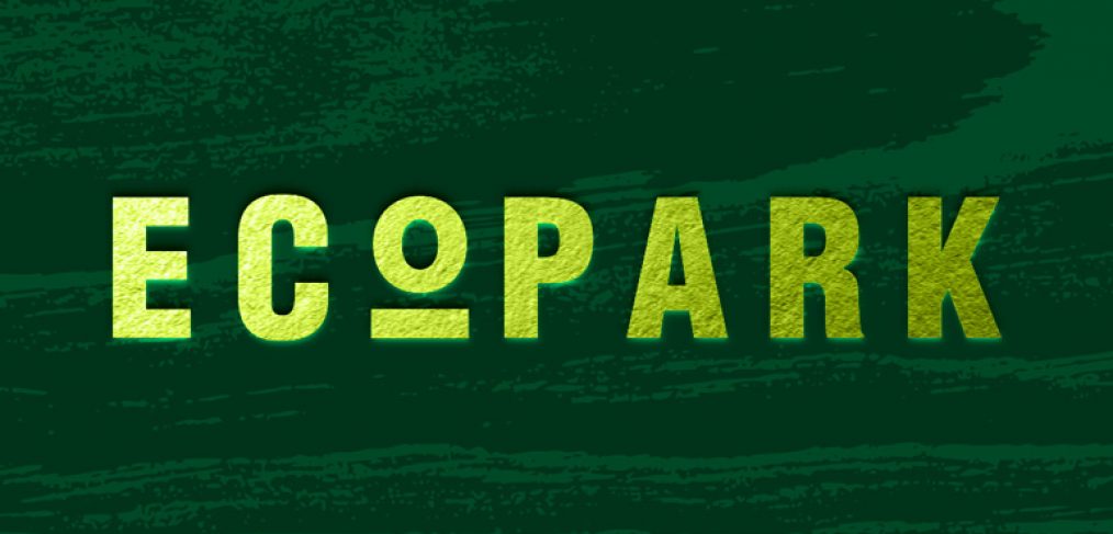
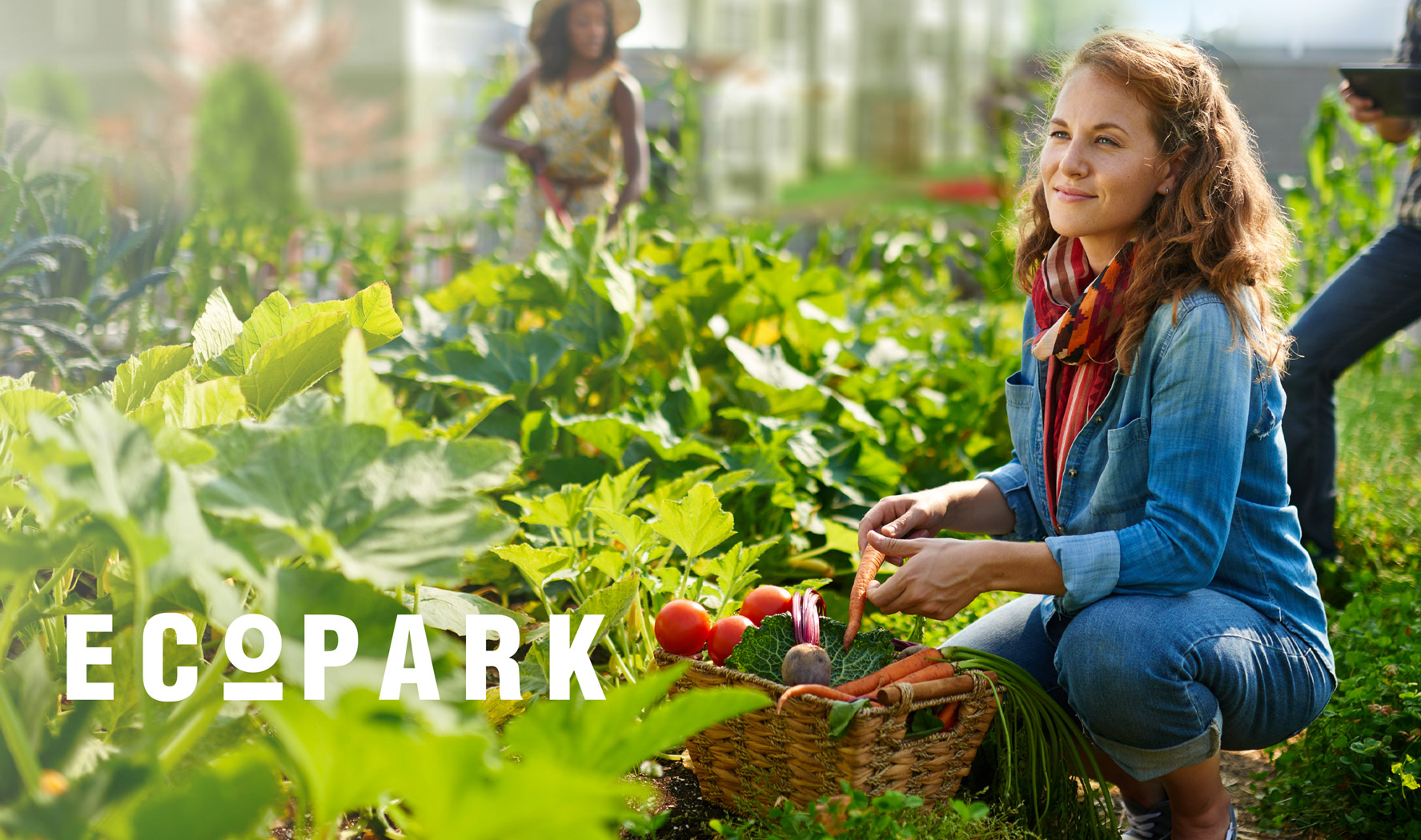
EcoPark is an innovative apartment complex property focused on sustainable living and state of the art technology and design. They were in need of branding to help bring their idea to life and convince investors that this was a great investment opportunity and economical boon for the city.

Solution

I created a modern brand design system that reflected the ideals of their building. I incorporated a fresh pallete of greens and other earthy tones to along with fresh photography and sleek typography. I created a custom minimal logo to represent the brand and incorporated all of these visuals in a book that was shared with city council members and potential investors. The book design was a hit that helped spark a lot of interest in EcoPark.

Services

+  Logo Design

+  Book Layout Design

+  Brand Guidelines

+  Photo Retouching

+  Iconography

+  Social Media

EZ Hang


Challenge

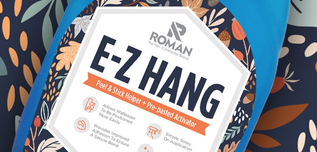
Rebrand a contractor focused product to be more approachable to the everyday diy consumer.

Solution

The solution was to inject some color and visual personality into the product labeling. I worked with the Roman team to understand the key demographic. I added a colorful nature pattern in the background that frames the content, along with large display text for the product name, E-Z Hang. I also added some easy to understand custom iconography to showcase the product features. The new colors compliment nicely and stand out on shelf. The packaging refresh was a complete success.

Services

+  Packaging Design

+  Strategy & Style Guide

+  Custom Iconography

+  Digital Mockups

+  Pre-Press Production

BRK


Challenge

After six decades of innovation in the contractor fire safety category, BRK was in dire need of a brand refresh. I partnered with BRK to help rebrand what had become a dated and confusing visual brand system. We used consumer research as our roadmap to redesign a brand experience that connected and simplified the shopping experience.

Solution

I was excited to build on a storied brand legacy and help usher BRK into the 21st century. After an extensive and collaborative creative process, we strategically developed a comprehensive, simplified, striking, and iconic brand visual system that connected with the targeted consumers.

Services

+  Logo & Identity System

+  Packaging

+  Strategy & Style Guide

+  Print Collateral & Digital Ads

+  Video

+  Retail Displays & POP

+  3D Modeling & Animation

+  Website Design

+  Social Media Content Creation

Loiza Dark


Challenge

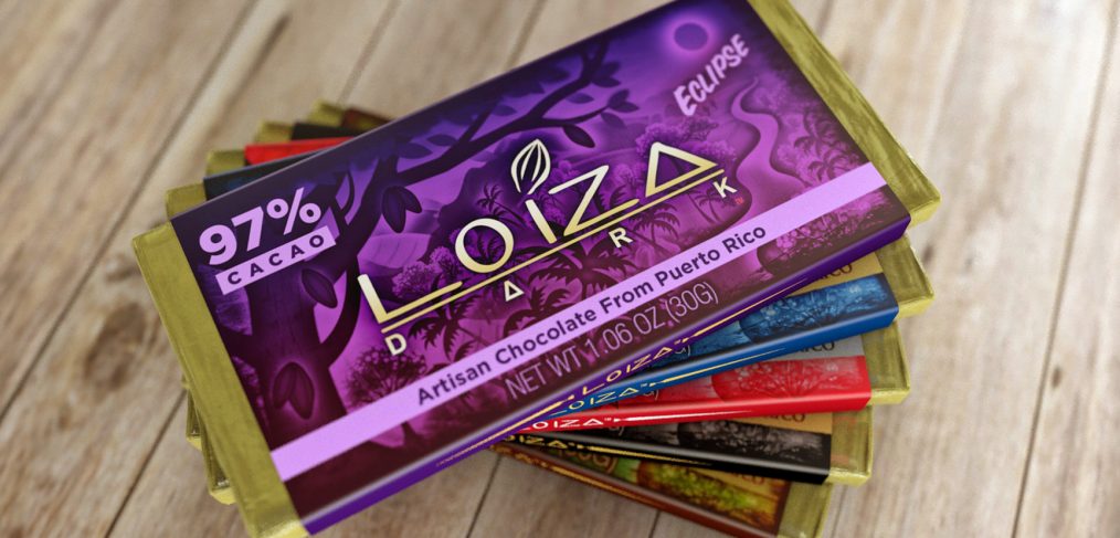
Loiza Dark is an Artisan dark chocolate brand from Puerto Rico. The challenge was to create a brand and packaging that resonated with customers and won on retail shelves.

Solution

I worked together with the Loiza team to arrive at a solution for the Loiza packaging and design system that has been overwhelmingly successful and lead to impressive growth in customer growth and product sales.

Services

+ Identity System

+  Packaging

+  Print Collateral & Digital Ads

+  Retail Displays & POP

+  Social Media Content Creation

First Alert

Challenge

After six decades of innovation in the home fire safety category, First Alert was in dire need of a brand refresh. I partnered with First Alert to help rebrand what had become a dated and confusing visual brand system. We used consumer research as our roadmap to redesign a brand experience that connected and simplified the shopping experience.

Solution

I was excited to build on a storied brand legacy and help usher First Alert into the 21st century. After an extensive and collaborative creative process, we strategically developed a comprehensive, simplified, striking, and iconic brand visual system that connected with the targeted consumers.

Services

+  Logo & Identity System

+  Packaging

+  Strategy & Style Guide

+  Print Collateral & Digital Ads

+  Video

+  Retail Displays & POP

+  3D Modeling & Animation

+  Website Design

+  Social Media Content Creation

Secureline

Challenge

Secureline has been a leader in the cordage, chain, and hardware accessories category for over forty years, however, after years of growth and innovation, it was time for a significant identity evolution. Secureline needed to modernize its brand to remain relevant to their audience.

Solution

I created a fresh and modern brand design system that resonates with their target audience and is flexible enough to adapt to the future. I refreshed all packaging (500+ skus), displays, POP, logos, iconography, and a merchandising system that clearly communicates on shelf. The result was a substantial increase on sales for Secureline products online and at retailers throughout North America.

Services

+  Logo design

+  Packaging

+  Brand guidelines

+  Iconography

+  Pallet & Merchandising

+  3D modeling & rendering

+  Illustration

+  Brand Strategy